Pressable Feedback
A press interaction layer adding ripple, highlight, hold-to-confirm, and progress feedback effects to any element.
Usage
Anatomy
Import the PressableFeedback component and access all parts using dot notation.
import { PressableFeedback } from "@thenamespace/uikit";

<PressableFeedback>
  <PressableFeedback.Highlight />
  <PressableFeedback.Ripple />
  <PressableFeedback.HoldConfirm />
  <PressableFeedback.ProgressFeedback />
</PressableFeedback>;
Comparison
"use client";

import { PressableFeedback } from "@thenamespace/uikit";
import { Button } from "@thenamespace/uikit/button";
Disabled
"use client";

import { PressableFeedback } from "@thenamespace/uikit";
import { Button } from "@thenamespace/uikit/button";
Hold Confirm Callback
Count: 0
"use client";

import { useState } from "react";

import { PressableFeedback } from "@thenamespace/uikit";Hold Confirm Durations
Different hold durations: fast (800ms), default (2s), slow (4s).
"use client";

import { PressableFeedback } from "@thenamespace/uikit";
import { Button } from "@thenamespace/uikit/button";
Hold Confirm Sweep
The clip-path reveal can sweep in four directions: right, left, down, up.
"use client";

import { PressableFeedback } from "@thenamespace/uikit";
import { Button } from "@thenamespace/uikit/button";
Pressable Cards
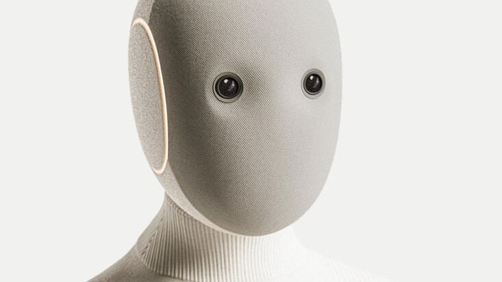
NEO
Home Robot
Indie Hackers
148 members
AI Builders
362 members

Bridging the Future
Today, 6:30 PM

Avocado Hackathon
Wed, 4:30 PM
"use client";

import { PressableFeedback } from "@thenamespace/uikit";
import { Avatar } from "@thenamespace/uikit/avatar";
import { Button } from "@thenamespace/uikit/button";Progress Feedback Callback
Count: 0
"use client";

import { useState } from "react";

import { PressableFeedback } from "@thenamespace/uikit";Progress Feedback Durations
Different progress durations: fast (800ms), default (2s), slow (4s).
"use client";

import { PressableFeedback } from "@thenamespace/uikit";
import { Button } from "@thenamespace/uikit/button";
Progress Feedback No Reset
With autoReset=false, the overlay stays revealed after progress completes.
"use client";

import { PressableFeedback } from "@thenamespace/uikit";
import { Button } from "@thenamespace/uikit/button";
Progress Feedback Sweep
The clip-path reveal can sweep in four directions: right, left, down, up.
"use client";

import { PressableFeedback } from "@thenamespace/uikit";
import { Button } from "@thenamespace/uikit/button";
Standalone Highlight
"use client";

import { PressableFeedback } from "@thenamespace/uikit";
import { ArrowRight01Icon, UserIcon } from "@thenamespace/uikit/icons";
import { HugeiconsIcon } from "@thenamespace/uikit/icons";Standalone Ripple
"use client";

import { PressableFeedback } from "@thenamespace/uikit";
import { ArrowRight01Icon, UserIcon } from "@thenamespace/uikit/icons";
import { HugeiconsIcon } from "@thenamespace/uikit/icons";With Highlight
"use client";

import { PressableFeedback } from "@thenamespace/uikit";
import { Button } from "@thenamespace/uikit/button";
With Hold Confirm
Press and hold buttons to see the clip-path reveal.
"use client";

import { PressableFeedback } from "@thenamespace/uikit";
import { Button } from "@thenamespace/uikit/button";
With Progress Feedback
Click once — the overlay sweeps in automatically.
"use client";

import { PressableFeedback } from "@thenamespace/uikit";
import { Button } from "@thenamespace/uikit/button";
With Ripple
"use client";

import { PressableFeedback } from "@thenamespace/uikit";
import { Button } from "@thenamespace/uikit/button";
CSS Classes
Base Classes
.pressable-feedback- Base pressable container with relative positioning and overflow hidden
Element Classes
.pressable-feedback__highlight- Opacity-based press overlay.pressable-feedback__ripple- M3-style radial ripple container.pressable-feedback__ripple-surface- Ripple animation surface with::before(hover) and::after(press) pseudo-elements.pressable-feedback__hold-confirm- Clip-path hold-to-reveal overlay.pressable-feedback__progress-feedback- Clip-path click-to-progress overlay
Interactive States
- Focus visible:
:focus-visibleor[data-focus-visible="true"]on.pressable-feedback(focus ring) - Disabled:
:disabledor[aria-disabled="true"]on.pressable-feedback(reduced opacity, no pointer events) - Hover:
:hoveror[data-hovered="true"]on parent activates.pressable-feedback__highlightopacity - Pressed:
:activeor[data-pressed="true"]on parent activates highlight pressed opacity
Data Attributes
[data-sweep="right|left|down|up"]on hold-confirm and progress-feedback - Clip-path sweep direction[data-holding="true"]on.pressable-feedback__hold-confirm- Currently being held[data-complete="true"]on hold-confirm/progress-feedback - Action completed[data-progressing="true"]on.pressable-feedback__progress-feedback- Progress is active
CSS Variables
--pressable-feedback-highlight-color- Highlight overlay color (default:currentColor)--pressable-feedback-highlight-opacity- Hover opacity (default:0.08)--pressable-feedback-highlight-pressed-opacity- Pressed opacity (default:0.12)--pressable-feedback-ripple-color- Ripple color (default:currentColor)--pressable-feedback-ripple-hover-opacity- Ripple hover opacity (default:0.08)--pressable-feedback-ripple-pressed-opacity- Ripple pressed opacity (default:0.12)--pressable-feedback-hold-confirm-duration- Hold duration (default:2000ms)--pressable-feedback-hold-confirm-release-duration- Release snap-back duration (default:200ms)--pressable-feedback-progress-feedback-duration- Progress duration (default:2000ms)--pressable-feedback-progress-feedback-release-duration- Reset snap-back duration (default:300ms)
API Reference
PressableFeedback
The root pressable container. Renders a button element by default.
| Prop | Type | Default | Description |
|---|---|---|---|
isDisabled | boolean | false | Whether the pressable is disabled |
children | ReactNode | - | Feedback layers and content |
className | string | - | Additional CSS class |
render | DOMRenderFunction | - | Custom render function to override the default button element |
Also supports all native button HTML attributes.
PressableFeedback.Highlight
Opacity-based hover/press overlay. No additional props beyond standard div attributes.
PressableFeedback.Ripple
M3-style radial ripple effect.
| Prop | Type | Default | Description |
|---|---|---|---|
duration | number | 150 | Duration in ms for the ripple grow animation |
hoverOpacity | number | 0.08 | Opacity of the hover state |
pressedOpacity | number | 0.12 | Opacity of the pressed state |
minimumPressDuration | number | 225 | Minimum press duration in ms |
isDisabled | boolean | - | Whether the ripple is disabled |
className | string | - | Additional CSS class |
style | CSSProperties | - | Additional inline styles |
PressableFeedback.HoldConfirm
Clip-path hold-to-reveal overlay.
| Prop | Type | Default | Description |
|---|---|---|---|
duration | number | 2000 | Hold duration in ms before the action is confirmed |
releaseDuration | number | 200 | Duration in ms for the snap-back animation on release |
sweep | 'right' | 'left' | 'down' | 'up' | 'right' | Which edge the clip-path reveal sweeps toward |
resetOnComplete | boolean | true | Whether to reset the overlay after the hold completes |
isDisabled | boolean | - | Whether the hold confirm is disabled |
onComplete | () => void | - | Fired when the hold reaches the full duration |
children | ReactNode | - | Overlay content shown during the reveal |
className | string | - | Additional CSS class |
PressableFeedback.ProgressFeedback
Clip-path click-to-progress overlay (auto, no hold required).
| Prop | Type | Default | Description |
|---|---|---|---|
duration | number | 2000 | Progress duration in ms before the action is confirmed |
releaseDuration | number | 300 | Duration in ms for the snap-back animation on reset |
sweep | 'right' | 'left' | 'down' | 'up' | 'right' | Which edge the clip-path reveal sweeps toward |
autoReset | boolean | true | Whether to automatically reset after completing |
resetDelay | number | 1500 | Delay in ms before resetting after completion |
isDisabled | boolean | - | Whether the progress feedback is disabled |
onComplete | () => void | - | Fired when the progress reaches the full duration |
onReset | () => void | - | Fired when the overlay resets back to idle |
children | ReactNode | - | Overlay content shown during the reveal |
className | string | - | Additional CSS class |